Open Thinkering

Menu

Tag: presentations

The 3 most important things I learned at ALT-C 2010

I’ve been at the Association of Learning Technologists’ Annual Conference (ALT-C) for the past few days. More detail on the sessions I attended can be found at my conference blog.

1. Presentation skills are extremely important

There’s some wonderful stuff going on out there, some great research and some fantastic theories. But people really do need to work on how they present their findings. There was much to disagree about in Donald Clark’s ranty, profanity-laden opening keynote, but finding ways other than the lecture to deliver stuff was something about which he was spot-on.

2. People eventually get the respect they deserve.

Those who plug away, roll the dice, and tirelessly promote something beyond ‘their job’ are eventually noticed. Of course, that’s not the reason they do what they do, which makes it all the better. Kevin McLaughlin and Cristina Costa, people I consider an integral part of my Twitter network, shared the prize of ALT Learning Technologist of the Year. I couldn’t be happier for them! 😀

3. It’s who you know not what you know

I used to think that the phrase “It’s not who you know, it’s what you know” was a bad thing. Not at all, it’s how people come together, stand on the shoulders of giants and achieve amazing things. Of course, there’s always going to be exceptions and those who use it for nefarious purposes, but on the whole people in education are good eggs.

How to design the ultimate presentation.

Introduction

This post has been a long time coming, but there’s three specific short-term causes to it appearing now:

  1. I’ve seen some fantastic content and ideas be let down by woeful presentations recently.
  2. Before next week’s JISC infoNet planning meeting, I’ve been asked to give some advice to my colleagues about presenting effectively.
  3. My Dad had an interview for a promotion last week and I helped him with his presentation.

Every awesome presentation has the following. Yes, every single one.

  • A call to action
  • One or more ‘hooks’
  • Appropriate pace
  • Little on-screen text
  • Imagery

How to plan the ultimate presentation

Start with your ‘call to action’. What do you want people to go away and do/think/say? Put that in the middle of a large piece of paper, or – better yet – a large whiteboard.

Around it, write down everything that you want to say on the topic. Spatial location indicates relatedness (i.e. the close it is to another point the more related it is to it). Draw a circle around every point. You’ve just created a Rico Cluster!

Next, identify your key points. They’re the points within circles that give your presentation its structure, those that would be noticeable if absent.

Finally, think about the order of your presentation. It goes something like this:

Hook –> Challenge –> Story –> Call to action

Designing the visual element of your presentation

You should by now know what the start and the end of your presentation is going to entail. You should have an idea of how you’re going to ‘hook’ the audience’s interest and then provide a ‘call to action’ at the conclusion.

Notice that I haven’t mentioned anything about the length of your presentation yet. That’s because it doesn’t really matter whether you presentation is 5 minutes or over an hour, the principles are the same! All that changes with the length of your presentation is the amount of content you need to prepare, and strategies for dealing with the wandering concentration of your audience. More of the latter in a moment.

I’m going to outsource the rest of this section to two wonderful resources I’ve come across recently. The first is mis-titled in my opinion: The Top 7 PowerPoint Slide Designs is actually about the structure and design of your presentation as a whole, rather than PowerPoint. It’s always good to have examples up your sleeve to broaden your repetoire.

The second is embeddable. I just love the focus on passion and significance coupled with practical advice!

Of course, you don’t have to use slides! For my Director of E-Learning interview, I made up a hashtag on Twitter and put that on the screen whilst I blu-tacked A4 sheets of paper to several walls… :-p

Kicking-ass when delivering the presentation

We’ve dealt now with the hook, the call to action, and having little on-screen text. This final section, then, deals with pace and imagery. A grasp of the appropriate use of pace is one reason why very good teachers are almost always very good presenters: they know when to speed things up and when to slow them down.

For example, if you’re letting people know about this amazing, exciting new thing then you’ll talk really quickly with lots of enthusiasm in your voice. If you’re emphasising a key point, on the other hand, you may want to take your time. Either way, it’s very important to practice. Use a video camera. Failing that, talk into the mirror. As a last resort, talk to a chair in the corner of the room. Seriously.

It’s obvious, but seemingly not understood by many. Your presentation is not the slides! Your presentation is the sum total of the experience people get when watching and listening to you present. That’s why imagery is extremely important. It’s more than appropriate and good-looking pictures on a screen. It’s about being evocative. It’s about using metaphors. It’s about conjuring up a world where people can’t help but respond to your call for action.

Conclusion

I’d love to help people present better. I’m not perfect myself – no-one is – but having a commitment to getting better at something means you’re half-way there to being better at it. And yes, these things can take huge amounts of time to do properly. One recent presentation of mine took, altogether, one hour for every minute I spent presenting! But, as Yoda famously says in Star Wars:

Do, or do not. There is no ‘try’.

Please feel free to get in touch if you think I can help! 😀

Image CC BY helgabj

Beyond boring Powerpoint presentations.

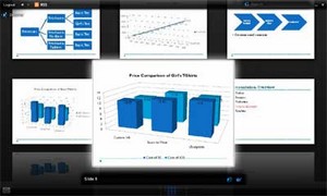
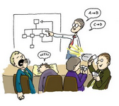
It’s easy to create a bad Powerpoint presentation. That’s because it’s easy to be fooled into thinking that because your audience is looking at something, they’re engaged with and by it. What is gained in clarity can be lost in repetition and boredom. Below are some ways to use Powerpoint more effectively and alternatives to spice up your content delivery.

First, though, here’s Don McMillan explaining some of the REALLY bad ways people use Powerpoint:

This text will be replaced

var so = new SWFObject(“http://www.edublogs.tv/flvplayer.swf”,”mpl”,”450″,”355″,”8″);so.addParam(“allowscriptaccess”,”always”);so.addParam(“allowfullscreen”,”true”);so.addVariable(“height”,”355″);so.addVariable(“width”,”450″);so.addVariable(“file”,”http://www.edublogs.tv/uploads/xvvgpn8zukcgkwgx.flv”);so.addVariable(“searchbar”,”false”);so.write(“player”);

5 quick tips if you MUST use Powerpoint…

  1. Never use a font size smaller than 24pt. If you have a large classroom, you may need to go even bigger than this. Stand at the back and check!
  2. Limit the number of words you have per slide. Don’t use them as an aid to remind you what to say. They should enhance what you are talking about, not repeat it! A great way is to limit yourself to 5 words and 5 bullet points. Alternatively, just use an image to represent your idea/concept/instruction.
  3. Find graphics that represent things you do frequently in lessons (perhaps from clipart) and always use these when doing a similar activity. For example, a pen writing for when it’s time to start work or two people talking for discussion/group work. These help reinforce good habits and aid classroom management.
  4. Use contrasting colours. The easiest way to do this is to choose an option from the ‘Slide Design’ menu. Otherwise, remind yourself of the colour wheel.
  5. Limit the number of different slide transitions in a presentation. One or two is classy, lots of different ones looks unprofessional.

Beyond Powerpoint…

There are lots of different tools that do a similar job to Powerpoint. For example, Keynote on the Mac and OpenOffice.org Impress (all platforms). But you don’t want to simply replicate Powerpoint’s functionality, you want to move beyond it.

Method 1 – Online presentations

Creating presentations on, or uploading presentations to, the Internet can be extremely useful. Not only does it give you access to better visual effects than Powerpoint can offer, but it makes them readily available to your students outside the lesson. The following three slides are taken from part of the very first lesson I had with Year 7 this academic year:

This is the same presentation when I uploaded it to Google Docs and tinkered slightly:

And here it is in the wonderful SlideRocket after using some of its functionality:

Zoho Show is another option. All of these are completely free or have a free basic option. I’d recommend Google Docs if you’d like to collaborate (or students to collaborate) on presentations and SlideRocket for fancy effects. The latter has a desktop version, although you have to upgrade your account to a paid-for version to be able to download it. Of course, if you just want to make your presentations available online, you could use SlideShare

Method 2 – Add interactive elements

  • Need to show some statistics and figures? Try richchartlive.com!
  • Add a short video clip to your presentation. Find it on YouTube, or another video-sharing site. Download and convert it (in this case to MOV or WMV format) via Zamzar.com. There’s an elearnr guide on how to do this here. 🙂
  • The PicLens plugin for Powerpoint 2007 means you’re not restricted to a linear presentation – and it looks cool! (see below)

Method 3 – Use a completely different approach

Ask yourself, “do I really need to use a Powerpoint-style format?”. If the answer is “perhaps not!” then check out some of these suggestions:

  • Glogster – we’ve already been through glogs on elearnr. They are a great, visual way to present as you can embed videos, audio and images quickly and easily.
  • Mindmap – why not demonstrate good practice and create a mindmap to present ideas? Students can learn organizational skills from this, and there are a number of collaborative mindmapping sites, including MindMeister, bubbl.us, Mindomo and Mind42.
  • Wiki – a wiki is a collaborative website. It’s also a great place to embed content from other websites and therefore a useful presentational tool. Your audience (i.e. students or other teachers) can also add their ideas and thoughts to it at a later date – if you want them to! I like Wikispaces, but it doesn’t seem to play nicely with our school network. I’d recommend, therefore, Google Sites, Wetpaint and PBwiki. I use Google Sites to run learning.mrbelshaw.co.uk 🙂

Finally…

Keep up-to-date with new ways and ideas for presenting ideas, concepts and content. The following are websites that can help:

Have YOU got any tips to share about good/bad practice when using Powerpoint?

css.php