One of the best way to learn new things is through imitation.
- Learning to play an instrument? Copy what your teacher does!
- Learning to paint? Try painting in the style of a famous artist.
- Learning to dance? Watch some videos on YouTube and attempt to replicate it in the comfort of your home.
That’s why, as I’m trying to become better at infographics, I really appreciate Nathan Yau’s guides over at FlowingData.com. Recently he had a great guide on how to create a ‘treemap’. I used slightly different variables (blog title, category, visitor time per post) and ended up with the following:

It was a fairly straightforward process:
- Export CSV from Google Analytics
- Select and tidy up data
- Fire up R and follow Nathan’s guide
- Tidy up in graphics program
***BONUS*** I knew this reminded me of something! Check out JDiskReport to visualize what’s on your hard drive in treemap format! 😀
(click on infographic to enlarge)
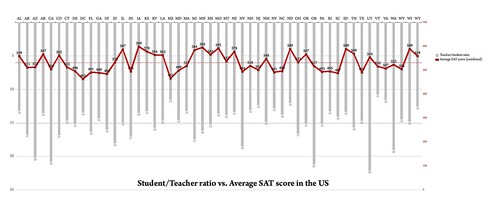
I’ve come across a wealth of fantastic infographics blogs recently. One of the best, and which has a community element is Flowing Data maintained by Nathan Yau, an UCLA PhD candidate. Nathan runs regular Visualize This competitions, the latest of which (closes 24 November 2009) compares teacher/student ratio with SAT scores by State.
The hardest bit, I’ve found, of creating an infographic is (perhaps obviously) working out how to visualize the data in a meaningful way. The problem with the raw data presented in this competition was that there were 3 SAT scores (reading, maths, writing) and that a meaningful correlation would assume an inverse relationship between this and teacher/student ratio.
In other words I had to figure out a way of plotting something increasing whilst the other decreased.
After a bit of playing around fruitlessly, I settled on the infographic at the top of this post. I’ve a few days left to change it a bit if necessary, but I think that it does, on the whole, do what’s required of it.
I’m never going to win the competition (a copy of David McCandless’ The Visual Miscellaneum) but, like entering a half-marathon or a 5k to focus your running routine, it’s still worth doing! 😀
