One of the best way to learn new things is through imitation.
- Learning to play an instrument? Copy what your teacher does!
- Learning to paint? Try painting in the style of a famous artist.
- Learning to dance? Watch some videos on YouTube and attempt to replicate it in the comfort of your home.
That’s why, as I’m trying to become better at infographics, I really appreciate Nathan Yau’s guides over at FlowingData.com. Recently he had a great guide on how to create a ‘treemap’. I used slightly different variables (blog title, category, visitor time per post) and ended up with the following:

It was a fairly straightforward process:
- Export CSV from Google Analytics
- Select and tidy up data
- Fire up R and follow Nathan’s guide
- Tidy up in graphics program
***BONUS*** I knew this reminded me of something! Check out JDiskReport to visualize what’s on your hard drive in treemap format! 😀
The consistently helpful Nathan Yau at FlowingData posted a brief tutorial this week on how to make heatmaps quickly. I had a play given that the UK government launched the surprisingly useful and well thought-out data.gov.uk recently!
Here’s what I came up with:
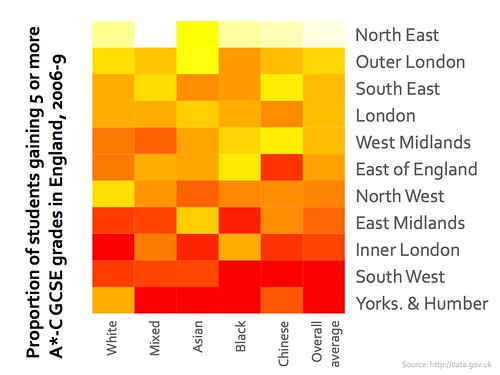
(yes, I too was surprised that the North East leads the way in number of students gaining 5 or more A*-Cs!) :-p
All that glitters is not gold, and not everything that looks pretty is an infographic. For example here’s a visualization of my recent connections on Twitter using mentionmap:

This looks good but isn’t very really very revealing. I’m well aware that I’ve been tweeting about tomorrow’s EdTechRoundUp TeachMeet (#TMETRU09) and with the people featured in orange. That’s why this is a visualization. It’s a pretty rendition of stuff I already knew.
TweetStats, however, produces something more revelatory:
")
We’ll ignore the fact that the service has mis-reported early 2009. 😉
What’s interesting is that this reveals something. It shows when I tend to tweet, how often I’ve done so in various months. There are other graphs beside these that give other interesting details.
Herein lies the difference between visualizations (uses non-numerical, qualitative stuff to represent something already known) and infographics (uses quantitative data to show or reveal something new).
Wikipedia:
(inspired by posts at FlowingData & information aesthetics)
