I’m a big fan of Futurelab‘s work. I’ve used their resources, been part of their Teachers as Innovators project, and even helped Dan Sutch (legend that he is) run a Futurelab seminar at BETT.
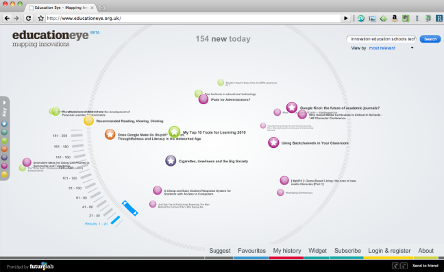
When they launched Education Eye I didn’t really get it. Now I do. RSS feeds pulled in from blogs and news outlets (including, yes, this one) and presented in a very visual fashion. I love the way that the dots are colour-coded according to ‘inspiration’, ‘Policy’, ‘Practice’ and so-on, with certain posts starred as Futurelab staff favourites. Awesome.
I mentioned on Twitter to Dan that this would make an amazing screensaver (like the Digg ones). Turns out they’re already working on it! And not only that, but they’re working on an Event Eye, ‘an indexed, searchable, content aggregator that pulls together the best content from the web about a particular conference or event.’ Double awesome.
Logging in gives you extra features. Check it out and share it with someone today! 😀
PS Dan had a bit of a disaster with his Twitter account! Help him rebuild his network by following him: @dansutch
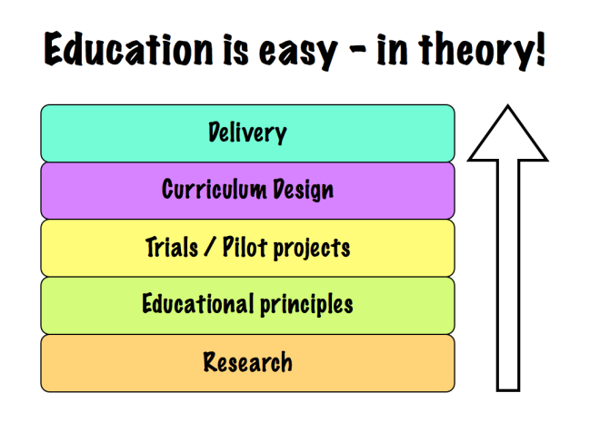
I can see now that it takes more than having passed through school as a student to understand the education system.* After all, it looks something like the diagram below, right?

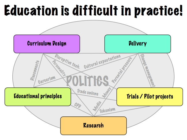
Of course those who have worked in educational institutions know that the above is far from the truth. Instead of, for example, research being the bedrock of all that goes on, it is marginalized and distorted. The issues** along the lines linking the elements together show how it’s a messy picture – not in itself a bad thing – and it’s distorted by politics (which is a bad thing) :-p

* Not that you’d know that from talking to your average member of the general public! 😉
** N.B. The reason I didn’t add ‘time’ as a factor in the second diagram is because, as I’ve said to a few people this week, time itself isn’t an issue. It’s priorities – which is a different matter.

(click image for larger version)
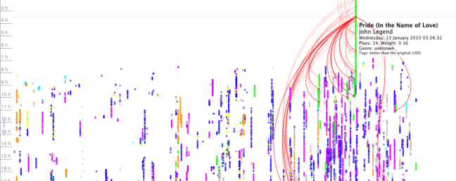
As you can see from the above visualization of my Last.fm history I’ve been using it for a fair while (since 19 March 2003 according to my profile). Recently, as I’ve gone Spotify-only, everything that I listen to is ‘scrobbled’ to Last.fm. Which makes the data from the latter part of 2009 onwards much more representative of my listening habits.
The time of day is down the side and putting your mouse over each ‘node’ links to other times you played that track. Sweet. 🙂
You can download LastHistory, the free Mac OSX app used to create this at: http://www.frederikseiffert.de/lasthistory/
(via FlowingData)

