Open Thinkering

Menu

Tag: diagram

Volcanoes and ambiguity

We all have mental models and ways we approach the world. Some of these are more conscious and visual than others. Here’s a diagram one I used in The Essential Elements of Digital Literacies that, at this point in time, is pretty much part of my ‘operating system’.

Continuum

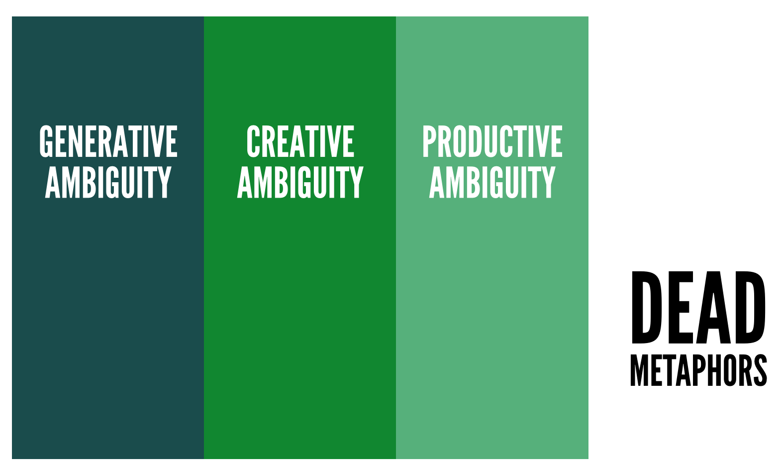
Recently, I’ve been thinking it makes more sense to think of ambiguity in terms of geographical strata, perhaps tied to the metaphor of a volcano.

Volcano
I need a better diagram, but you get the idea…

The lowest strata represents Generative ambiguity. Here, words are used as symbols for ideas that are very hard to express; an individual gives a name to a nebulous collection of ideas or thoughts. They struggle to make this approach make sense to others.

The middle strata represents Creative ambiguity. This is where one part of an idea is fixed, but the other part has a lot of freedom of movement. A good example of this would be appending ‘digital’ or ‘e-‘ to existing ideas – such as ‘e-books’ or ‘digital literacy’. Others can begin to see what the person is getting at.

The erupting volcano represents Productive ambiguity. This is where the real work is done at scale. Concepts can be productively ambiguous through straight metaphor, or by mass (media) convergence on a particular term. It resonates with many people.

The area on the surface represents dead metaphors. These are concepts that have become clichรฉs. They don’t do any productive work and are usually over-used. They don’t particularly mean anything any more.

Does this make any sense? It does for me and helps me make sense of my information environment. However, it’s perhaps it’s not ‘productively ambiguous’ enough for others yet! ๐Ÿ˜‰

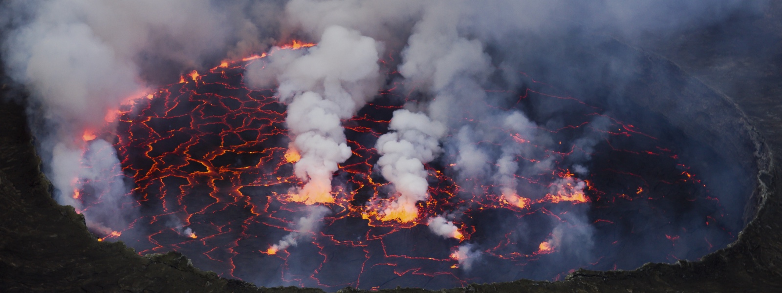
Main image CC BY-SA Cai Tjeenk Willink

Web literacies? (v0.2 beta)

Web literacies? (v0.2 beta)

In the run-up to me starting full time with the Mozilla Foundation I’ve been continuing my thinking on web literacies.

The above diagram is based upon the excellent work of Michelle Levesque, my diagramming of her work, and some subsequent post-it notes.

I’m thinking out loud here.

Things that have changed since the last version:

  • Move from ‘web literacy’ to ‘web literacies’
  • Themes (exploring, connecting, building, protecting) organised hierarchically
  • Removal of ‘calling APIs’, ‘manipulating data’ and so on
  • Update: The colours no longer mean anything (thanks @PatParslow!)

I realise that the last of these could be contentious. The reason I’ve removed these more technical aspects has nothing to do with whether I think they’re important. Of course they are.

It’s just that if you start from the endpoint of describing someone who’s ‘web literate’ I think it’s entirely possible not to be able to ‘call an API’ yet still be web literate.

What do you think?

I’d really appreciate some feedback – this is still very early work! ๐Ÿ™‚

How to focus in the age of distraction. [GRAPHIC]

How to focus in the age of distraction

(click on image for larger version hosted on author’s website)

I came across the above diagram on Google+ recently. Having not posted much about productivity recently, I thought this was the perfect opportunity to share something I’ve found really helpful.

What I like about this is that it’s colourful, immediately obvious, and includes some stellar advice! ๐Ÿ™‚

The author, Sharon Genovese of Learning Fundamentals, asks for a donation if you’d like to use any of her (awesome) mindmaps.

css.php