Open Thinkering

Menu

Tag: visualization

The future of my Ed.D. thesis.

A couple of people have very kindly been in touch privately to offer their thoughts on my Ed.D. thesis. Both expressed concern that I don’t seem to be up-to-date with my research! Whilst that’s very kind of them, I’d like to reassure both them and everyone else that I (think I) know what I’m doing. 🙂

Here’s my roadmap, if it helps:

My 2010 Ed.D. thesis roadmap

As you can see, I’m delaying writing about digital literacy until next summer. Why? Things move fairly quickly in this field. I want to be as up-to-date as possible when I submit!

In addition, I’m in the bizarre position of doing a vocational doctorate in a non-empirical, purely conceptual fashion. How odd. :-s

My first infographic competition.

Flowing Data competition - US class sizes vs. SAT (v2)

(click on infographic to enlarge)

I’ve come across a wealth of fantastic infographics blogs recently. One of the best, and which has a community element is Flowing Data maintained by Nathan Yau, an UCLA PhD candidate. Nathan runs regular Visualize This competitions, the latest of which (closes 24 November 2009) compares teacher/student ratio with SAT scores by State.

The hardest bit, I’ve found, of creating an infographic is (perhaps obviously) working out how to visualize the data in a meaningful way. The problem with the raw data presented in this competition was that there were 3 SAT scores (reading, maths, writing) and that a meaningful correlation would assume an inverse relationship between this and teacher/student ratio.

In other words I had to figure out a way of plotting something increasing whilst the other decreased.

After a bit of playing around fruitlessly, I settled on the infographic at the top of this post. I’ve a few days left to change it a bit if necessary, but I think that it does, on the whole, do what’s required of it.

I’m never going to win the competition (a copy of David McCandless’ The Visual Miscellaneum) but, like entering a half-marathon or a 5k to focus your running routine, it’s still worth doing! 😀

Infographics and my future.

I’ve been thinking a lot about the future recently and my career trajectory. I’m not sure I want to stay in schools forever and, perhaps, even in education. To that end, I’ve been exploring other avenues. One such avenue is the world of infographics:

Information graphics or infographics are visual representations of information, data or knowledge. These graphics are used where complex information needs to be explained quickly and clearly, such as in signs, maps, journalism, technical writing, and education. They are also used extensively as tools by computer scientists, mathematicians, and statisticians to ease the process of developing and communicating conceptual information.

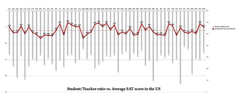
Over the last week or so I’ve been playing about with a few applications that can be used to create infographics. Whilst some, such as ManyEyes, are almost self-explanatory and produce results like this:

Literacy rates by country

…it takes something a bit more sophisticated to produce this:

Example of infographic created with 'Processing'

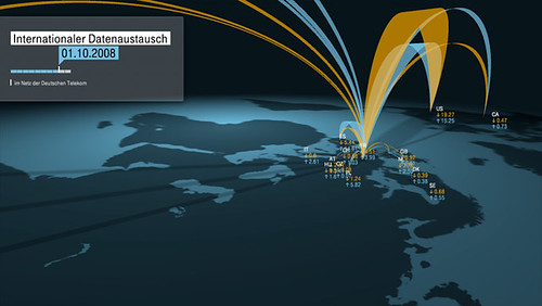
The creator of the above used the (thankfully free and Open Source) software program Processing. However, the words ‘steep’ and ‘learning curve’ spring to mind, so I may have to buy a book to teach me. :-p

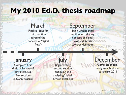
Of course, infographics don’t have to be amazingly flashy to convey information effectively. Check out the Wordle created from my Ed.D. thesis (as it currently stands) below:

Wordle of my Ed.D. thesis as at 13/11/09

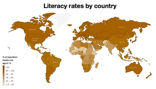
Finally, programs such as OpenOffice, Powerpoint and Keynote can be used to create infographics. I created the following in Keynote as a practice – it shows average Primary classroom sizes across OECD countries. It took me a couple of hours – the most fiddly part is aligning everything!

Comparison of Primary class sizes in state-funded schools within OECD countries (2007) v3

The most important thing, of course, is to have reliable data. The above was created after studying Education at a Glance: OECD Indicators. The second most important thing is to represent the data in a way that makes interepretation easy and obvious. The third thing is that it should look pretty… 😉

Have I whetted your appetite for infographics? I hope to publish some more here soon, but in the meantime, check out these excellent infographics-related blogs:

css.php