
TB871: Mapping my situation of interest
Note: this is a post reflecting on one of the modules of my MSc in Systems Thinking in Practice. You can see all of the related posts in this category.
Activity 2.1 asks us to look at a situation of interest and identify:
- the problem being fixed
- the action taken to fix it
- the immediate effect
- the longer-term effect.
I’m still a beginner with causal loop diagrams, but I’ve tried to map some of the issues in my situation of interest using kumu:
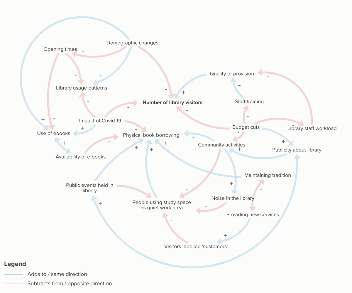
If one number goes up or something increases, and the thing linked to it goes up or increases as a result, then it is said to ‘add to’ or be in the ‘same direction’. In the above diagram these are indicated by blue lines. Meanwhile, if the opposite happens then it ‘subtracts from’ or is in the ‘opposite direction’. This is indicated by red lines.
For example, if more e-books are available, then (one could argue that) physical book borrowing goes down. So that arrow is red. And if the quality of provision goes up, then one might argue, in the absence of data, that the number of library visitors would go up. The slightly confusing thing, for me at least, is that the plus and negative symbols refer to the causal relationship rather than whether the impact is positive or negative. This can be shown by thinking of the quality of provision going down, for example, leading to the number of library visitors being reduced.
From my diagram, it’s evident that:
- The aim is to improve the number of people visiting the library
- Actions taken to fix this include holding community events
- The immediate effect is an increase in the number of people visiting the library from various demographic groups
- The longer-term effect is fewer people visiting the library for quiet study due to the amount of noise and the availability of the study space
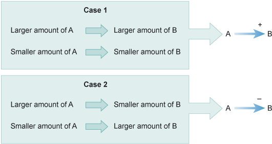
EDIT: I’m adding in the diagram below from Section 2.2.2 of the module because it’s helpful:
References
- The Open University (2020) ‘2.1.1 An overview of SD’, TB871 Block 2 Tools Stream [Online]. Available at https://learn2.open.ac.uk/mod/oucontent/view.php?id=2261481§ion=2.1 (Accessed 26 May 2024).