The difference between visualizations and infographics.
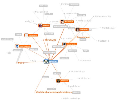
All that glitters is not gold, and not everything that looks pretty is an infographic. For example here’s a visualization of my recent connections on Twitter using mentionmap:
This looks good but isn’t very really very revealing. I’m well aware that I’ve been tweeting about tomorrow’s EdTechRoundUp TeachMeet (#TMETRU09) and with the people featured in orange. That’s why this is a visualization. It’s a pretty rendition of stuff I already knew.
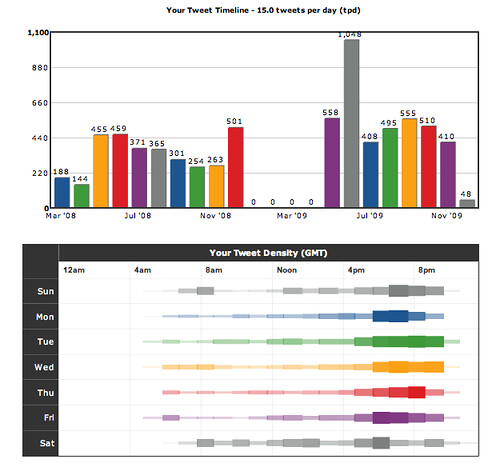
TweetStats, however, produces something more revelatory:
We’ll ignore the fact that the service has mis-reported early 2009. 😉
What’s interesting is that this reveals something. It shows when I tend to tweet, how often I’ve done so in various months. There are other graphs beside these that give other interesting details.
Herein lies the difference between visualizations (uses non-numerical, qualitative stuff to represent something already known) and infographics (uses quantitative data to show or reveal something new).
Wikipedia:
(inspired by posts at FlowingData & information aesthetics)


Hi Doug. I’ve enjoyed your recent posts on information visualisation and this is an interesting way of defining visualizations and infographics. I would suggest distinctions might be better determined by recognising the disciplines from which they originally evolved – computer sciences, mathematics and graphic design etc. – but I think these and related terms are becoming increasingly blurred anyway. In most forms of visualisation, the predominant purpose would seem to be to facilitate a more rapid or coherent understanding. Yet how often do we question the neutrality of either the author, the artistic or technological process they employ, or the visual and cultural metaphors they adopt? To quote from T S Elliott’s The Rock; “Where is the wisdom we lost in knowledge? Where is the knowledge we lost in information?” As we become increasingly exposed to visual and multimodal forms of information, it is necessary we acquire the skills not only to understand the resulting artefacts, but to recognise the agencies and processes around which they are formed.
Thanks for the comment, Andy. You’re absolutely right about
questioning the neutrality of the author. I saw a shocking
misrepresentational ‘infographic’ yesterday that implied that there
was no way that a certain political party could win in the area I
live.
I endeavour to put the source of my information on the infographics I
produce – and would encourage others to do likewise. :-)