TB871: Cognitive mapping, causal-loop diagramming, and a refreshing use of SODA
Note: this is a post reflecting on one of the modules of my MSc in Systems Thinking in Practice. You can see all of the related posts in this category.
In a previous post I gave an overview and introduction to Strategic Options Development and Analysis (SODA). This approach uses cognitive maps, as distinct from causal-loop diagrams. In this post, I’m going to outline the differences between them.
Differences between causal-loop diagrams and cognitive maps
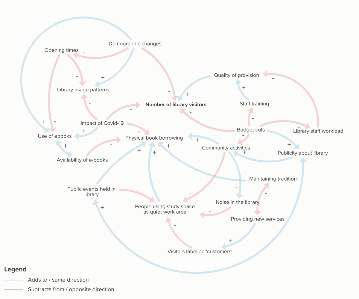
Causal-loop diagrams model the causal interconnections within a situation. This kind of diagramming tool for illustrating how different elements of a system influence each other. The primary questions it addresses are “what is happening?” and “how does it happen?” You can see an example of this kind of diagram in this post about my situation of interest.
Cognitive maps focus on capturing how individuals or groups think about an issue. While causal-loop diagrams are, of course, subjective they are presented in an objective way. This is not the case with cognitive mapping, which clearly represent thoughts and perspectives of the people involved, laying them out in a structured way.
Cognitive mapping is less constrained in the use of text than causal-loop diagrams, with the aim (as much as possible) to capture the actual words of participants. These kinds of maps aim to answer “what do we think is happening?” and “how might we make this happen?” Cognitive maps capture subjective perspectives, often facilitated by an external person who helps articulate the thoughts of others. They are used to explore possible scenarios rather than model actual situations.
Creating Cognitive Maps with SODA
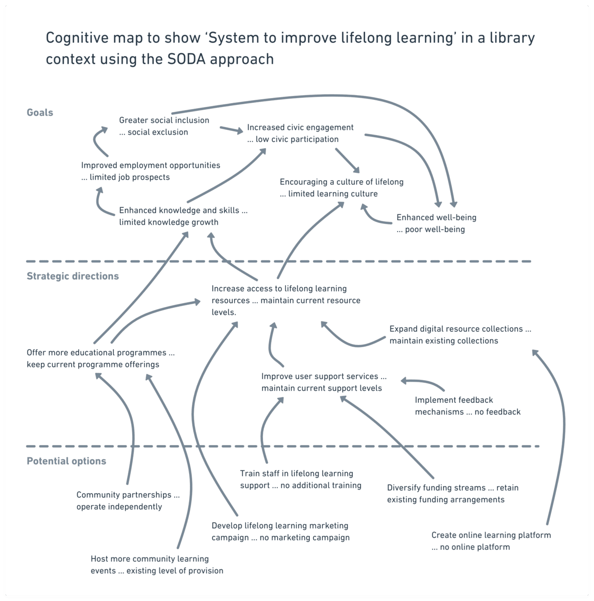
The SODA approach offers a structured method for constructing cognitive maps. My system of interest is “a system to promote lifelong learning” in a library context. Here’s how we might approach that, remembering that the ellipses (three dots) connect the construct with its opposite:
- Identify a key decision: begin by identifying a critical decision, such as Enhancing lifelong learning opportunities.
- Seed construct: develop a seed construct like “increase access to lifelong learning resources … maintain current resource levels.”
- Hierarchy of planning: organise the constructs into three levels: goals (ideals), strategic directions (objectives), and potential options (tasks), placing the seed construct towards the top of the strategic options.
- Develop constructs: generate related constructs such as:
- “expand digital resource collections … maintain existing collections”
- “offer more educational programmes … keep current programme offerings”
- “improve user support services … maintain current support levels”
- Link constructs: draw connections between constructs using arrows to show relationships — e.g. “expand digital resource collections” might link to “increase access to lifelong learning resources” with a positive arrow, while “limited funding … secure additional funding” might link negatively.
- Iterative refinement: refine the map continuously by:
- adding new constructs and links as the understanding of the problem evolves
- grouping related constructs
- removing less useful ones to maintain clarity
SODA map of my system of interest
I’ve had a go at creating a SODA map below. Bearing in mind that the following is the first of these I’ve ever created, I think it’s turned out OK:
Further thoughts
I can imagine this being useful in a user research setting, as it allows you to take a central concept and then ‘ladder down’ to potential options and then ‘ladder up’ towards broader goals. Allowing the user research participant to see the map could help them explore the conversation more visually, going back to concepts and see dependencies.
I’ve seen this kind of thing in action in a different context when working with Bryan Mathers when we’ve done thinkathons together. He would draw out conversations, for example using a Defining the Cast activity and we’d all be able to refer to things that were said earlier in our time together.