The story behind the new design of dougbelshaw.com
Whilst I haven’t tinkered with the theme for this blog (yet!) I’ve changed the landing page when you visit dougbelshaw.com. There’s a bit of a saga behind it. :-p
A tweet from Kathy Sierra directed me to Brynn Evans’ (@brynn) blog where she had a great post about an idea called ‘betacup’. What struck me about Brynn’s blog, however, was the clear and straightforward layout. Summising that she was running WordPress (most blogs, including this one, do!) I looked in the footer for an indication of the theme she was using.

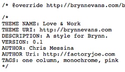
Hmm… no dice. Another way to find out a blog’s theme is to use the ‘view source’ option in your web browser (View/Page Source in Firefox). Sure enough, this revealed the following:

In other words, the theme being used was in a folder with the title love_work. Again, summising that this was probably short for Love & Work, I searched Google for it. No joy.
Refusing to be beaten and now intrigued, I looked at the CSS by following the link above. CSS stands for ‘Cascading Style Sheets’ and it is the method used to ‘style’ the blog. Authors often put their details at the top of such documents:

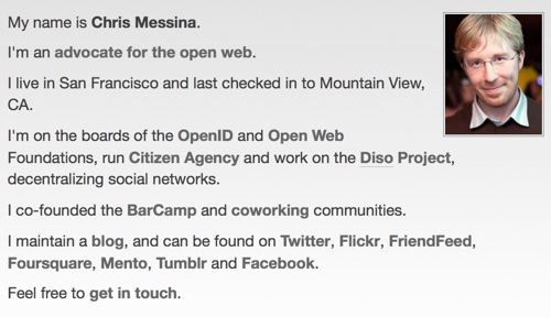
Although a little downhearted that it would seem that the author – a ‘Chris Messina’ (@chrismessina)- created a custom theme (meaning it was probably generally available for me to tweak) I decided to visit his website – factoryjoe.com. I was impressed with what I saw:

I thought this was wonderful. Not only does it link to everywhere Chris is online (and deems important) but it tells a story. Unthinkingly (and to my shame) I set about copying him. I ended up with this (CC-NC-SA factoryjoe):

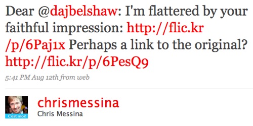
I did mention on Twitter what I’d done (in fact my network were very helpful in my tweaking it) leading to this tweet the following morning from Chris:

Whilst Chris was a gentleman and agreeable about it, others were a bit more to the point. The outcome was that I realised I needed to do my own thing rather than copy someone else’s design. After all, as someone who makes his living through web technologies, it’s only fair that Chris’ design is unique. 🙂
I spent a while thinking about what I wanted and, to cut an already-too-long story short, with the help of my Twitter network, I’ve ended up with this:

Yes, I’ve had all the comments that I’ve got stubble on my head, it’s a bit ‘noir’, it looks like a dating site, and I look like I work for Apple. Oh, and my wife wants me to point out that she took the photo. 😉
I may not be finished my tinkering yet. Chris has challenged me to incorporate a hCard and I really like the design simplicity of the Flickr blog. However, again, it’s a custom-designed theme…

![Reblog this post [with Zemanta]](http://img.zemanta.com/reblog_e.png?x-id=fbf20c88-24b8-425c-9253-7b3bf100c46c)
Great story – loved reading it and learned from it. I think your “own thing” description communicates more clearly than the original. I like it. I might copy it. ;->
And your wife took a great photo!
I have to say, Doug, that I really like your re-design. It’s clear, colourf and accessible.
Which is not to say that the content isn’t good, either …
Great writeup! I’m glad to see your story out there (honestly) cause I’m sure this happens to lots of other people. And your new site really does look great!
Thanks for the write up — all in all, I think the results speak for themselves. I’m always flattered when people find inspiration from my work (it’s happened before) but part of the point of design is to communicate something originally, and to really consider what the colors, shapes and words all mean when put together.
Simply taking someone else’s design is kind of like putting on their clothes and thinking that you’re still yourself! You really want to make your own homepage and blog represent you — and your vision of the world. It’s perfectly reasonable to start with ideas and designs that you like and use for inspiration, but it really gets interesting (for you and other people!) once you add your own aesthetic style to the mix.