Introduction
I’m off work ill today, having succumbed to the bugs brought by two separate sets of visitors in the last week. Fun.
When I’m ill, which is thankfully an occurrence seemingly less frequent that it used to be whilst I was in the classroom, I see it as an opportunity to ‘step outside of the stream’ and do something slightly different. I’m constrained, obviously, by a need to avoid overly exerting myself but, in a way that my parents didn’t understand when I was a teenager, there are as many and varied things one can do in the digital world as there are in that of the physical.
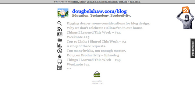
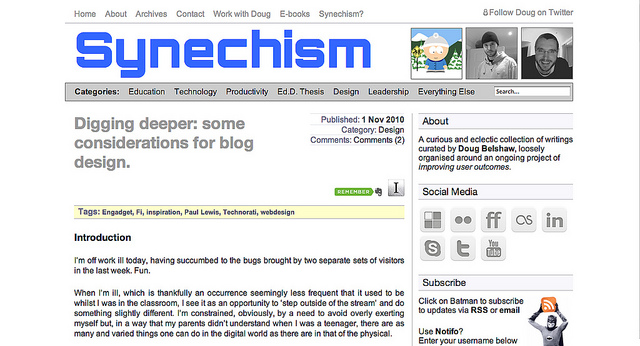
Today, then, I decided to continue the ongoing saga of the redesign of this blog. Whilst to some the design of their blog is merely a choice between pre-existing themes, to me it’s – perhaps slightly pretentiously – much more than that. Not only is it an opportunity to do some research in the field of webdesign and user experience (which I always enjoy) but it’s an chance to reflect upon my digital identity and the facets I deem important to present to other people.
Popular blogs
Whilst Technorati may have taken somewhat of a dive in popularity since the heady days of 2005, it’s nevertheless useful for ascertaining which blogs are the most popular. There is, of course, a problem with equating the most widely-read and visited blogs with effective design and user experience, but I’m going to assume that there must be at least a significant overlap. Those with a large readership are likely to be the most effectively monetised and therefore will have the ability to redesign to improve that monetisation. Or, at least that’s the theory.
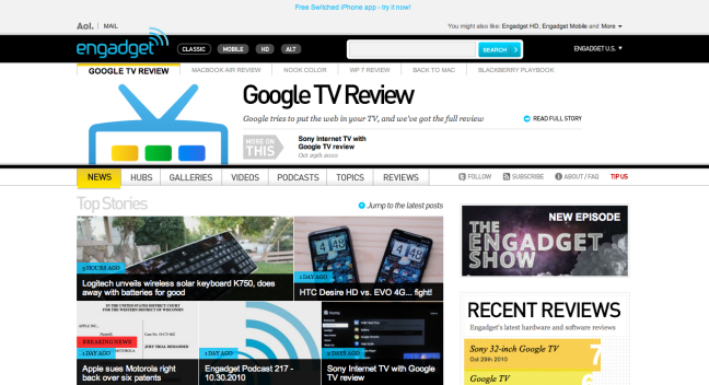
After looking at some of the top blogs I came to realise that the functionality of a blog depends massively on the expectations of its audience. Most of the top 50 blogs are about either politics or technology. Whilst I blog about the latter (and occasionally about the former) the type of technology being talked about on the top blogs is the latest and greatest. This is reflected in the shiny shiny nature of the blogs and short, sharp updates. Take Engadget, for example, a blog that I, for one, read every day:

Good practice, is of course, contextual. That is to say that what works in one field doesn’t necessarily work in another. A blog is not a blog is not a blog.
Refocusing
Looking at Technorati’s categories for a better alignment, it was difficult to see a ‘natural fit’ for a blog like this one which ostensibly covers ‘education, technology and productivity’ but also delves occasionally into leadership, design and philosophy.
It turns out that the Technorati’s business directory looked to have the best fit. I should say that my aim in doing all of this is not to slavishly replicate an existing design, monetise this blog or become a dedicated follower of fashion. Instead, I’m looking at what works in practice, not just on the drawing board (and, to be honest, in my head).
Here’s thumbnails of the top 10 (fairly loosely-defined) ‘business’ blogs:


Notice anything?
- Sidebars on the right
- Coloured bar at the top
- Easily identified logo
- Coloured sections in sidebar for highlighted content
- People’s faces
- White backgrounds
Digging deeper
Looking at the top themes is all very well, but in my daily digital digressions I often come across sites which feature elements or an overall design that I find pleasing. I’ve attempted recently to start adding the tags ‘webdesign’ and ‘inspiration’ to my delicious links but it’s early days.
Here’s some sites I’ve come across recently that have pleased and/or inspired me:
- TECHi – clean, clear with colour-coded categories and thoughtful typography.
- Cennyd Bowles on user experience – very crisp and obvious functionality (as you’d expect from a UX guy) – nice used of ‘mulletised’ post structure.
- Joe Hewitt – minimalist yet distinctive.
- 37 Signals – colourful whilst still being predominantly white; simple.
- Bryan Boyer – über-minimalist, stripped down to the bare essentials (Google cache as seems to be down)
Extrapolating from the above, it would appear that the things that appeal to me most are:
- Minimalism (or at least, stripped-down design)
- Innovative use of colour
- Appropriate typography
Finally…
Having come across Cameron Moll’s Good vs. Great(er) Design a couple of months back I felt I needed to go back through it. Awesome does not even begin to describe how good this slidedeck is! Check it out (I’d click on menu to go full-screen):
My favourite parts?
- Great design produces an emotional response
- “The simplest way to achieve simplicity is through thoughtful reduction” (John Maeda)
- Effective design is like good poetry
All of these considerations are why people pay people such as my friend Paul Lewis at Fi to do these things for them. Not me, I’m interested in the nuts and bolts. 😀

