A brief history of infographics.
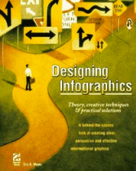 I recently picked up the classic Designing Infographics: Theory, creative techniques & practical solutions by Eric K. Meyer for an absolute song. Published in 1997, the ‘practical solutions’ part is dated, but the theory and techniques section is as relevant as every. What really interested me was the opening section on the history of infographics, some of which I’d like to share with you.
If heiroglyphics count as infographics, then of course they are around 5,000 years old. Sumerian ‘letters’ were combined with pictures to explain concepts, provide explanations and tell stories. A little more recently in the western world, graphics have been used to represent quantitative data. One of the first examples of this is Nicole d’Oresme (1352-82), Bishop of Lisieux, who combined figures into groups and graphed them. Leonardo da Vinci was fond of mixing graphics and text, especially in his Treatise on Painting.
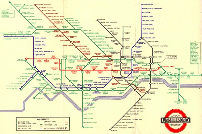
Modern infographics can be traced to William Playfair’s ‘information graphics’ for The Commercial & Political Atlas, published in 1786 and containing 44 graphics (mostly line, ‘fever’ or bar charts). Subsequently, Otto Neurath (1882-1945), a sociologist, developed the ‘Vienna method’. This stressed the importance of simple images to explain data. Neurath documented everything in graphic form that he researched statistically, founding the ‘Isotype’ movement (International System of Typographic Picture Education) – an attempt at a world language without words. This, coupled with Modernism, had ‘a profound impact on graphics and design world-wide’. The London Underground map is a product of this movement:
The USA took longer to start using infographics, with the early adopters being Fortune magazine, the Chicago Tribune and the New York Times (the latter now being a leader in the field). Researchers Turnbull and Baird in 1962 realised the importance of infographics – in a world before the internet, 24-hour news and cable television:
Tests have proven that material of the same content has been received, read and acted upon in one form, but discarded in another. These examples, coupled with the knowledge that every reader is offered much more than he can ever assimilate, assert that graphic techniques are too important to be ignored.
By 1981 other newspapers were using infographics but it was the launch of USA Today in 1982 and its commitment to using graphics every day that started the real trend. Some of these, however (the types of bread – white, wheat or rye – preferred by members of Congress) were merely filler. In Germany, Der Spiegel had been experimenting with more artistic infographics since the mid-1950s.
The dawn of computers had a massive effect on infographics. ‘Desktop publishing’ became more than just a casual phrase when desktop computers, partnered with the first laser printers, led to reductions in newspaper department workloads by 15-20 hours per week. This freed up time to experiment with infographics. With programs available for the Apple Mac such as MacDraw, newspapers no longer required skilled artists laboriously hand-drawing each infographic.
As the processing power of computers grew, so did their ability to represent complex data in a visually-appealing way. In 1990, research carried out by the Gallup Organization showed that graphic elements possessed greater power than originally thought. They used computerized headgear to record what readers saw on a page, noticing that visual elements received a great deal of attention. Follow-up studies confirmed this and that readers were left with more memorable impressions than when presented with words only.
The dawn of the internet has led to an explosion in interest and use of infographics. Many and diverse software packages and web applications are available to represent your data visually. If you’re interested, try the following three:
- Google Docs Spreadsheets (‘insert chart’)
- ManyEyes
- Tableau Free

