
Towards a visual hierarchy of Open Badges
This week I’ve been working with a client on the first stages of a visual hierarchy for Open Badges. This is more complex than it sounds and there are a couple of things that you should have a look at before reading further. The first is Carla Casilli‘s post A foundational badge system design, and the second is the Badge Studio* created by Andrew Hayward during his time at Mozilla.
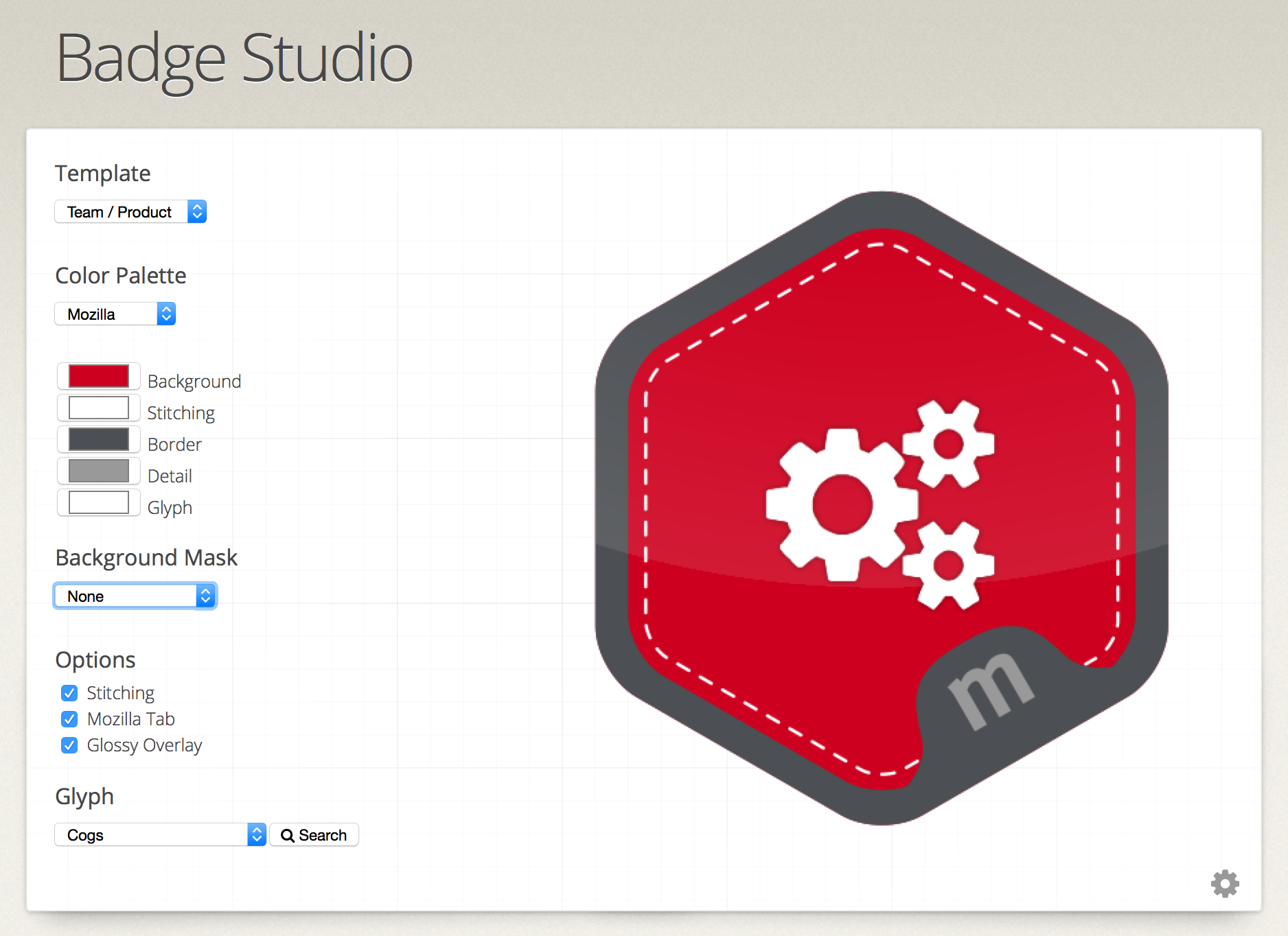
* This is an Open Source project and can be found on GitHub here.
What I like about the Badge Studio approach is that it:
- is easy to use
- has a visual hierarchy baked-in
- makes it very difficult not to follow a style guide
- removes the bottleneck of visual badge design
Variables
As with everything, the simpler and more intuitive something looks, the more work has gone into it in the first place. Here’s some variables we identified for badges across the group of companies of which my client is part:
- Organisation
- Badge name
- Badge yype
- Icon/glyph
- Level
- Logos/brand
- Pips (as on military insignias)
- Expiry
- Meta status (i.e. whether it’s part of, or is a meta-level badge of badges)
Differentiators
I’m sure there are others to consider, too. From there we looked at the most obvious differentiators, deciding upon shape and colour. Happily, there’s already a defined colour palette in place for each organisation that’s part of the group. They’ve also just launched a new group identity that includes five different shapes! Perfect.
Text
We agreed in the preliminary meeting that we’d try and reduce the amount of text on the badge itself. This was for two reasons: (i) users should only ever be a click away from the metadata contained in the badge, and (ii) text is likely to be difficult to read if the badge is displayed at a small pixel size.
Complexity
Theoretically, every badge issued could be both a ‘meta-level’ badge made up of smaller badges and itself part of a larger ‘even-more-meta-level’ badge. It’s potentially turtles all the way down. To prevent this potential/perceived complexity, I’ve proposed we limit the number of layers to three. This chimes well with Carla’s work mentioned above. In practice, this leads to very simple and straightforward badge pathways – which, if you want, get way more complex.
Conclusion
Creating an ecosystem of value is an extremely difficult thing to do. Essentially, you have to have to create enough productive ambiguity for it to be flexible and adapt to different contexts, while simultaneously giving people enough structure to get started. The way I’m proposing we approach that in this example is to:
- Nail down badge colour (organisation) and badge shape (type)
- Place a limit on the number of badges that can count towards a meta-level badge (perhaps six, using Trivial Pursuit as a metaphor?)
- Keep iterating on the taxonomy we’ve started.
- Look into what makes a good icon for an iOS/Android app (they rarely include text)
- Consider where/how to show both my client’s brand and the brand of any organisation they partner with.
- Create/keep a list of badge display requirements that are separate to the badge itself (e.g. how ‘expired’ badges look within a profile)
- Look into forking Badge Studio to create a version for my client’s group of companies.
If you’ve got examples of a good hierarchy of visual design for Open Badges, I’d love to see it! 🙂
PS You’ve completed my 2015 reader survey, right?
4 thoughts on “Towards a visual hierarchy of Open Badges”