
Blog redesign: October 2012 edition
(Email and RSS subscribers will need to click through to see the change)
I’ve felt for a while that I should make this blog better suited to mobile interfaces and, in particular, touchscreen devices. This is known as responsive web design and I’ve been particularly impressed with Microsoft’s ‘Metro’ design language leading to a tiled approach on Windows smartphones. To my eyes it seems streets ahead of Apple’s skeuomorphism.
Yesterday, when I was browsing architecture blogs and came across the Contemporist site, it reminded me of that clean, touchscreen-friendly approach:

I did something I always do when I see blog themes I like: right-clicked to ‘View Source’ as you can tell which blog theme is being used. Judging by the CSS it’s a custom job, meaning I couldn’t simply download the same theme.
That was a shame, but it spurred me on to look for Metro-inspired blog themes. I was looking for something with a tiled, fairly squarish look but that didn’t scream Microsoft. Beautiful though it is, the Subway WordPress theme (from €39) was out of the question. I’d have looked like a Microsoft fanboi:

I also found the MetroStyle theme ($45), which I rejected for having too many boxes at the top:

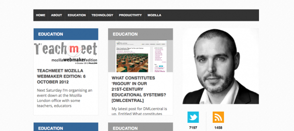
I downloaded and installed the WP Metro theme (£FREE), but I had trouble making it look decent with my content:

In the end, after considering signing up to a course to get the Anaximander theme, I decided to pay $35 for a WordPress theme entitled Metro:

Like many premium themes it comes with an extremely easy-to-use configuration dashboard in addition to the usual WordPress options. Nevertheless, old habits die hard and I delved into the CSS to tinker about a bit!
I hope you like what you see, and if you want to see the ‘responsiveness’ in action, either resize your browser window or visit this site on a mobile device. It’s only my first attempt – I’ll be tinkering around making improvements here and there over the next few weeks.
Any feedback is gratefully received!
Notes:
- You can see previous iterations of my blog on Flickr: 2009-10 / 2010-11 / early-mid 2012 /
- More Metro-inspired design
- I love the theme Colin Wright has at flashpack.co. It’s called Focus ($20) but it’s Tumblr-only, unfortunately!
Hi Doug,
I like it. Very clean, and easy to read.
Is there any reason for the two lots of ‘related posts’ at the bottom?
Have you thought about adding a ‘recent posts’ lists to the sidebar (at least in the sidebar for single posts – it would throw out the balance on the home page)? Would be one or two less clicks for people who arrived via a directly link?
Really must get round to having another play with mine. I’ll add it to the ‘to do’ list!
D
Hi Dave, glad you like it. 🙂
Disqus recently added a ‘related posts’ feature – hence it doubling-up. I’ll fix that.
Great idea about the recent posts links when people come directly to a particular post. Will think through the design issues!
Nice design. I think you need a bigger picture of yourself at the top.
You’d think so, wouldn’t you? 😉
24 hours on, and I’ve already made substantial changes. I had completely forgotten (how could I?!) about the awesome work on the Firefox OS branding: https://blog.mozilla.org/ux/files/2012/09/mozilla-mozcamp-firefox-os.024.jpg