
A subtle redesign.
As I’ve mentioned several times before, pretty much everything I do is perpetual beta. What that means in practice is that I’m always looking to make things better – including this blog!
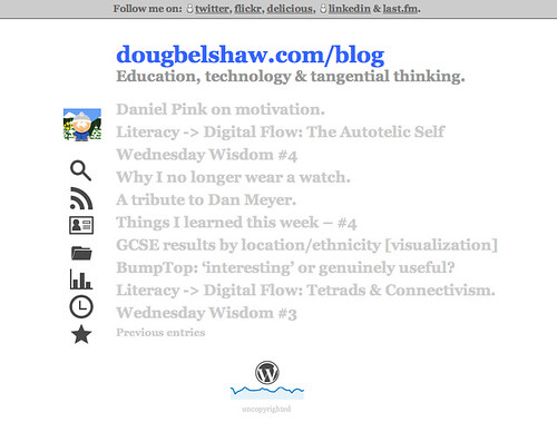
The three subtle changes I’ve made are:
- Menu text replaced with icons (it was a bit text-heavy)
- Slide-down posts replaced with links to permalinks (to speed-up page loading and encourage commenting)
- Addition of WordPress icon and sparkline (mini-graph) to footer* (looks cool!)
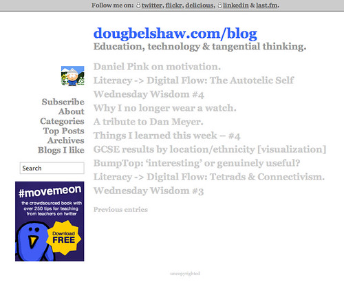
You can see a quick before and after below.
Before:
After:
The icons, in case you’re wondering, can be found here. They may be used ‘without attribution’ for personal and commercial projects.
Update: I’ve added ‘tooltips’ (using this) at the request of some who found the icons needed explaining. Thanks for the feedback! 😀
*I’ll explain how I did this next week. It’s easy but took some researching…
Just as long as I can recognise what the icons are for – I am seriously impressed. Love it!
Thanks! I need a way for some type of ‘tooltip’ to be displayed when you put your mouse over them. Not working (for me) at the moment…
I like the redesign – and thanks for the icon link. I started using icons in my course wiki’s homework page last term, but had trouble finding icons I felt free to use, that I liked, and that were consistent. The icons indicate to the students what kind of homework it is, reading, posting a text response, or creating and posting an audio piece.
No problem – I like it when people give stuff away, no strings
attached! :-)
Very good Doug – the icons suit the minimalist style! While I’m typing this, do you have a total count of sales/downloads of movemeon? DM @jamesmichie if you do!
Yep, we’re at just over 2,600 downloads at the moment! :-)