
GCSE results by location/ethnicity [visualization]
The consistently helpful Nathan Yau at FlowingData posted a brief tutorial this week on how to make heatmaps quickly. I had a play given that the UK government launched the surprisingly useful and well thought-out data.gov.uk recently!
Here’s what I came up with:
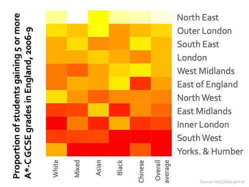
(yes, I too was surprised that the North East leads the way in number of students gaining 5 or more A*-Cs!) :-p
Hi Doug, Looks useful, but hard to interpret without a key. What do the colours represent? Also, and this may be a personal thing (esp being a geographer ;), I think that spatial data is far better represented in map form. Also need the relative proportions of each ethnic group for the information to be useful.
Looks nice though :-)
Yes, I agree completely – but I don’t know how to do that yet! :-)
A guide to the colour codes would have been helpful – people outside the country have no idea what to expect, and thus no basis for assigning grades to colours.
A good point – and it mapped onto an outline of the UK would have been
even better. Walking before I can run, though! :-)