Major blog redesign.
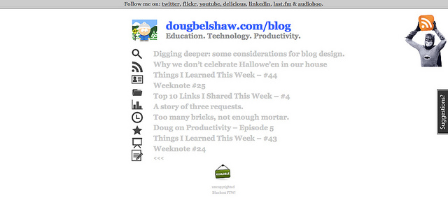
This blog used to look like this (click to enlarge):
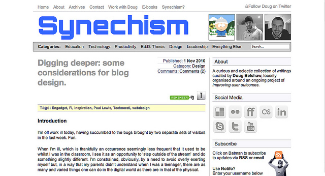
Now it looks like this (click to enlarge):
Why?
- More information
- Better user experience
- It was time to tinker
Continuities: things that have stayed the same
- Reasonably similar colour scheme
- Prominent links to social media profiles
- Obvious links to RSS and About page for new visitors
- Links to related posts
- Evernote and Instapaper integration
Innovations: things that have changed:
- New name for blog, to enable guest posts improve identity
- Photos of real Doug, not just social media avatar
- Use of @font-face web font (Orbitron from The League of Moveable Type)
- Change of body font from Georgia to Arial (it’s easier to read online)
- Recent comments in sidebar
- Links to e-books
- Better use of footer
You like? Wondering why Synechism?


I like it Doug – clean and clear, but the sidebar adds an element of serendipity for readers to come across other things they might like.
Hope you’re feeling better soon!
Thanks Dave! 🙂
Really like it! Love thwe bold header & the information on the side is clear. Well done that poorly man!
Nice redesign, and I love the new name.
Thanks Stephen, that means a lot. :-)